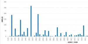
Let’s say you’re a higher education leader and all you want is a simple Bar Chart counting your Admission Applications by Term.
Having a quick chart like this lets you spot the overall trend – are your applications increasing, fluctuating, decreasing over time?
If all you have is delivered tools, here’s what you need to do:
- Navigate to Query Manager
- Name your Query and be tech savvy enough to know the table you want is ADM_APPL_PROG
- Select the EMPLID and ADMIT_TERM fields into your query
- Click on the EMPLID field and select Aggregate > Count
- Select Sort By Admit Term in Descending order
- Save your Query
- Click on ‘Publish as Pivot Grid’
- Name your Pivot Grid and navigate through the 5 or so steps to setup and publish your Pivot Grid.
- Finally you have your Bar Chart!
- Estimated Time: 15 minutes
If you use Insight Maker, here are your steps:
- Navigate to Insight Maker and select the Admissions Dataset
- Select Student ID (count) and Admit Term
- Provide a name for your chart and click “View Pivot Grid”
- Congratulations you have your Bar Chart!
- Estimated time: 60 seconds